
Consistency across digital products is one of the primary selling points for design systems and is also a common theme across most definitions of what they are.
Design systems bring order and consistency to digital products.
Andrew Couldwell, Laying the Foundations
again…
A connected, package-managed, version-controlled software product that contains the smallest set of components and guidelines an organization needs to make digital products consistently, efficiently and happily.
Dan Mall, What is a design system
and again…
Design systems are great for developer efficiency, visual consistency, and accessible experiences.
Sparkbox, Yes, Design Systems Do Improve Developer Efficiency and Design Consistency
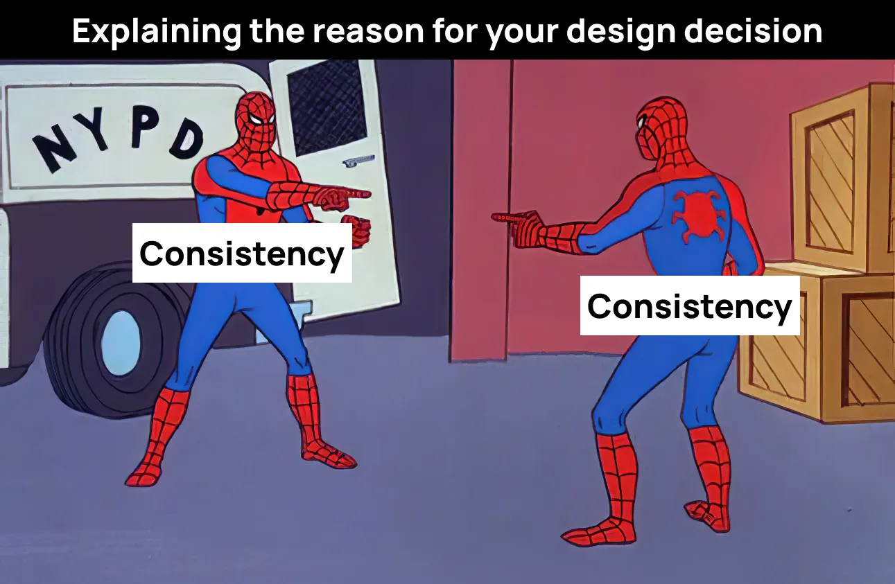
What is consistency?
The term “consistency” is often thrown around without a clear understanding of its impact within a design system and its consumers.
In design meetings, individuals may play the consistency card to support their arguments, yet they suggest entirely different solutions.
For example:
- Person 1: “We should make our iOS typography scale match the Web so it’s consistent”
- Person 2: “I disagree, we should use the default iOS typography scale so it’s consistent”
Without a shared definition for fundamental terms, it presents an opportunity for confusion, effecting both design system teams and their consumers.
Consider the term ‘accessible’. Does it communicate conformance to WCAG, or the state of no known barriers for users with disabilities?
Similarly, the term ‘consistency’ is inconsistently understood. This article aims to explore such inconsistencies within design systems.
Has it already been defined?
One of the earliest definitions of consistency within the context of digital design is in Jakob Nielsen’s 10 Usability Heuristics, first written in 1994. The 4th principle, ‘Consistency and Standards’ states:
Users should not have to wonder whether different words, situations, or actions mean the same thing. Follow platform and industry conventions.
Jakob Nielsen, 10 Usability Heuristics
Wait a second… 🤨 If we should follow platform and industry conventions, why do we keep creating new design systems, all with their own set of conventions?
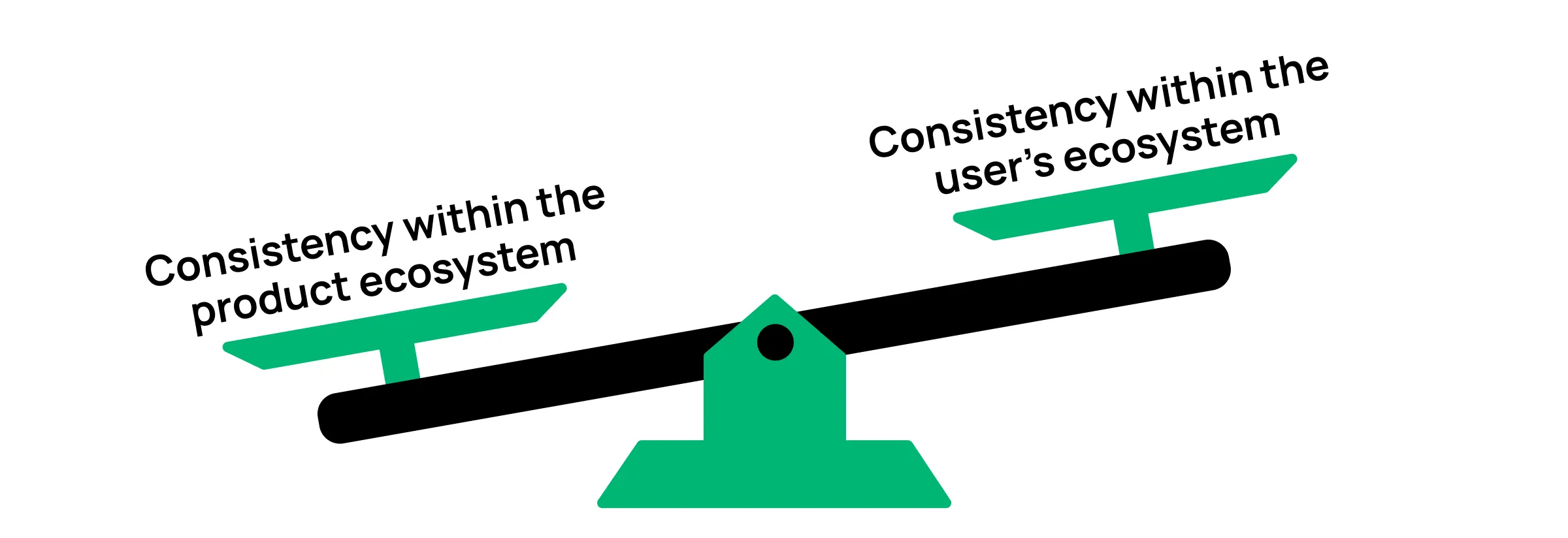
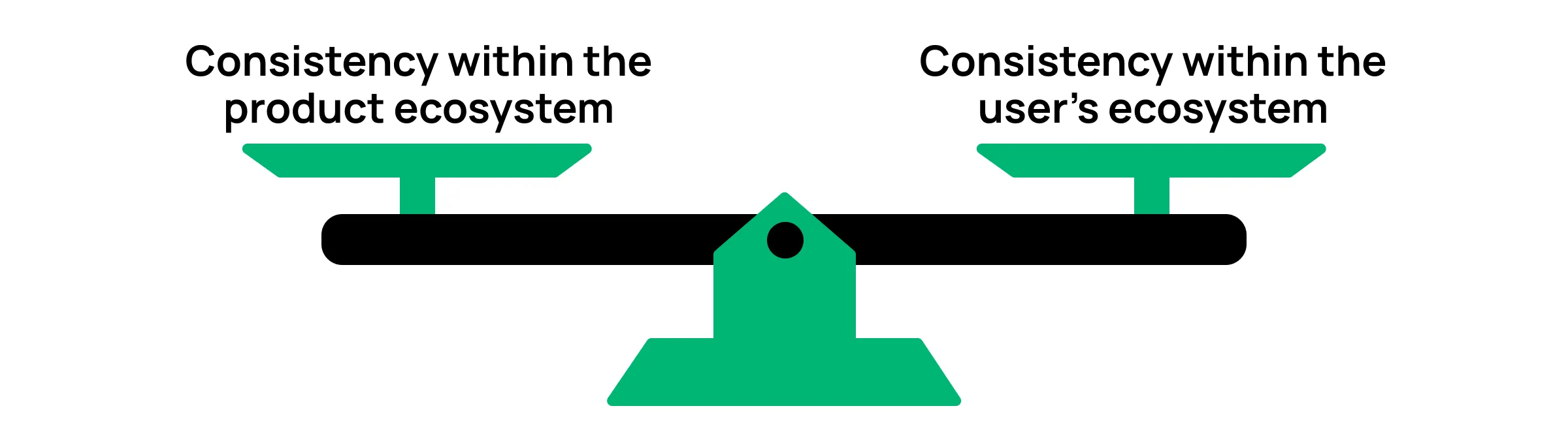
Consistency within the product ecosystem
A mature design system has multiple, interconnected pieces that help improve consistency across a product. There’s the coded components, the design libraries, design tokens, documented guidance, and support.
On their own they don’t create consistency, but together they can align the end products visually, behaviorally, and semantically to be consistent. This type of consistency is known as internal consistency, or as I like to refer to it, consistency within the product ecosystem.
This seems to be the most common definition of consistency across design systems, and often a large selling point for their existence. If a mature design system exists with all its parts, in theory, the connected digital products will feel like one ecosystem.
Consistency within the user’s ecosystem
External consistency, is about creating consistency within the user’s ecosystem. What is the user’s ecosystem?
Users spend most of their time on other sites. This means that users prefer your site to work the same way as all the other sites they already know.
Jakob’s Law
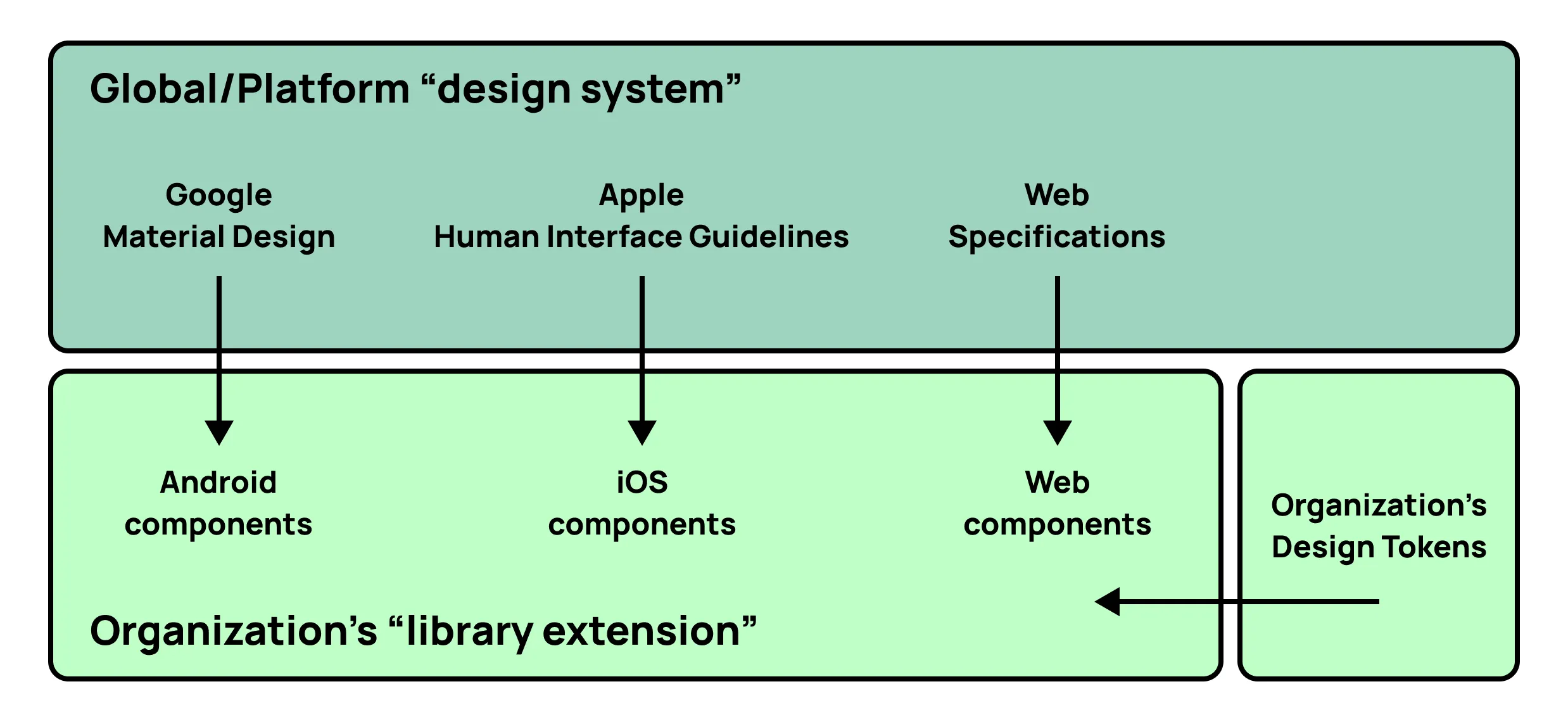
If a user downloads an iOS app, they expect it to work similar to the other iOS apps they have already downloaded.
This is one of the reasons why Apple publishes the Human Interface Guidelines for its platforms, and Google does that same with Material Design. It’s also why I am a supporter of Brad Frost’s call to action for a Global Design System.
The consistency conundrum
Design systems often heavily focus on creating consistency within the product ecosystem, and it makes complete sense, since that was likely communicated as a key value-add when asking for investment for the system.
There is nothing wrong with focusing on this of course, it is important for many reasons. The problems arise when the focus in unbalanced against consistency within the user’s ecosystem — especially for systems that are still in their earlier stages of maturity.
Speed
When establishing a system, there is often an initial period where stakeholders are watching to see how the system can deliver its proposed value, and they don’t want to wait long for those results.
Other than Buttons and Text Fields, it’s rare to find a component that is visually and functionality similar across Android, iOS, and Web. When you’re trying to deliver at speed, creating consistency within the product ecosystem can be one of your greatest challenges.
For example, take the Android Dialog and the iOS Alert component. Both serve very similar functions, by giving the user “critical information”, however they are visually distinct.
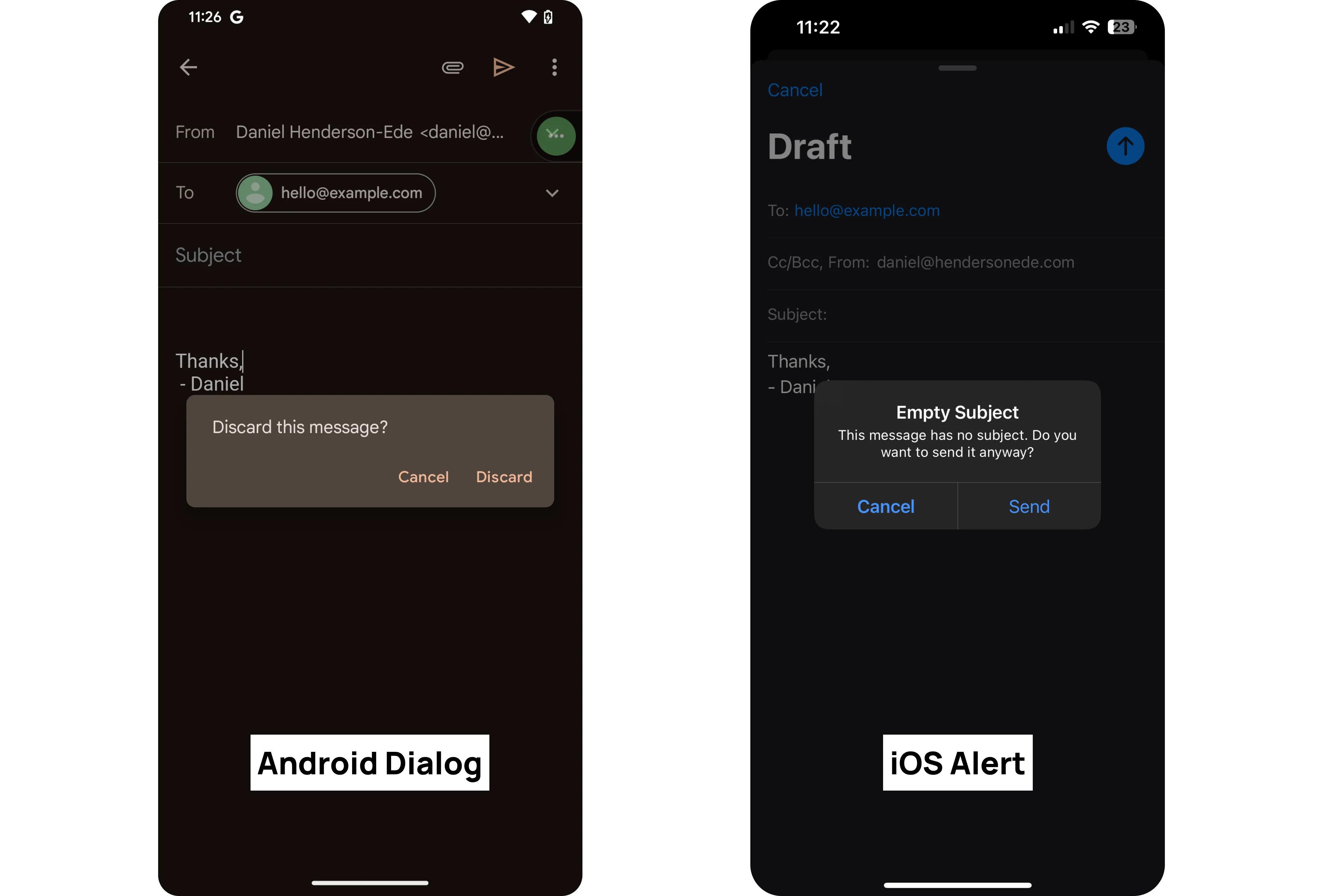
It requires much less development effort (if any at all) for the design system team to rely on the stock control provided by the platform that user’s are already familiar with. It also means engineers consuming the component have an API they are familiar with that reduces the barriers to adoption, so you can deliver value to product teams much faster.
Accessibility
By depending on the platform’s stock controls, it reduces the number of accessibility considerations and provides an experience disabled customers are more likely familiar with. Stock controls usually come with the following support:
- Dynamic Type (font scaling)
- Increased Contrast
- On/Off Labels for switches
- Roles/Traits for assistive technologies
When design system teams try to customize controls to make them look like another platform, these items are often not considered in that decision. Because they are not considered, their default support is often lost through style overrides or rebuilding the component. Many of these accessibility features can be added back to the component, but it takes time to re-design and re-implement them, with no clear additional value provided to disabled customers.
Maintainability
To create a components visually, functionally, and semantically aligned, there often are a few hacks behind the scenes to make the magic happen. But with the fast-paced environment within the native mobile world, you may reduce the reliability of your design system, especially if the versions and frameworks used by your product teams are highly fragmented.
For products with mature design systems that see their customers use the same service across multiple devices; it makes sense to push towards more product consistency. Spotify is a great example of this, the Android, iOS, Web apps all are very similar.
Almost 3 years ago, Material Components for iOS was placed into maintenance mode as there was a shift towards relying on features within UIKit and SwiftUI — only creating highly custom components when needed. This is a great example of resetting the balance of consistency even in mature systems.
On July 15, 2021, the Material Components for iOS library and its related Material Foundation and Material Motion dependencies entered maintenance mode…
We recommend that you follow Apple’s Human Interface Guidelines and consider using modern UIKit components or SwiftUI instead. Both offer a high degree of flexibility through which you can express your product’s brand while providing a predictable and familiar Apple platforms experience for your users. You’ll also benefit from ongoing investments Apple makes in accessibility, ease of use, and deep integrations with OS features.
Material Components for iOS, GitHub Repo
Platform-first approach
I’m a believer in something I call a “platform-first” approach to design systems.
As design system maintainers, we should create our own design systems in the same way we expect consumers to use our design system.
- What does the platform system already provide that can be reused in your system?
- Can those items be consumed to create recipes or new molecules that can be distributed in your system?
- What customization ability does the platform system provide to create more consistency within the product ecosystem?
I believe this approach is a more maintainable, scaleable, and accessible method for design systems. Even if you disagree, I challenge you to try create a definition of ‘consistency’ for your system so there is shared understanding for the future.
To learn more about this topic, listen to Episode #1: Consistently Inconsistent on the Design Systems Rodeo podcast.